
Pretty but unusable
A polished visual layer over a structure that makes people hunt for the one thing they came for.
Interfaces designed around how people decide.
We design interfaces around how people actually decide — what they came for, what they need to see, and the smallest number of steps between those two things.
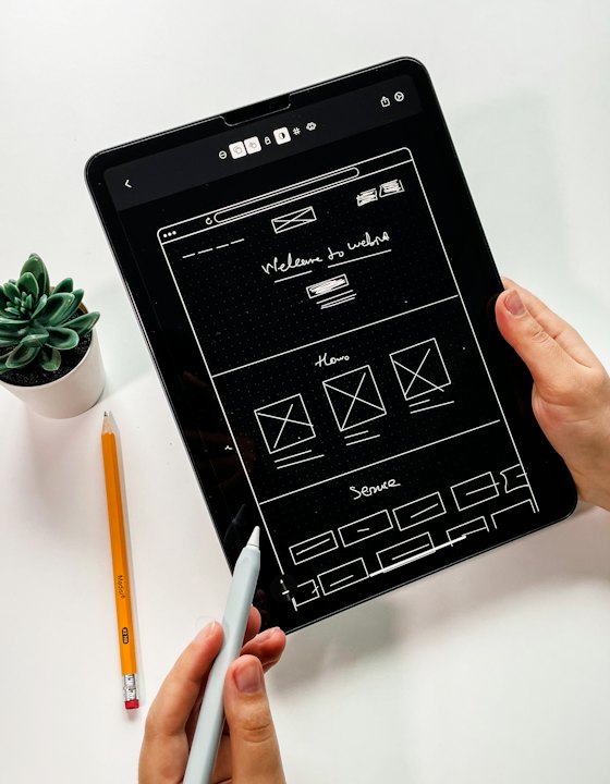
Design gets treated as the paint at the end — the part that makes a finished build look nicer. By then the structure has already decided whether the thing is usable.
We design before the build, from the journey inward: what a nursery customer needs to choose a plant, what a lab user needs to read a measurement. The visual system comes after that, and it comes as a system rather than a set of screens.
The patterns we see most often when a business asks us to look at what they have.
A polished visual layer over a structure that makes people hunt for the one thing they came for.
No shared components, so buttons, spacing and type drift apart and the build slows down.
Screens that demo well on a wide monitor and fall apart on the phone people actually carry.
Low contrast, tiny type and colour used as the only signal — fine for the designer, hard for everyone else.
From the first conversation through to the live build and the support after it.
The steps someone takes to get what they came for, before any screen is drawn.
Structure and hierarchy settled in low fidelity, where changes cost minutes rather than days.
Type scale, colour, spacing and states defined once and applied everywhere.
The real thing with real content, reviewed with you before engineering starts.
How every layout reflows from phone to desktop, specified rather than left to chance.
Components, tokens and states documented so the build matches the design.
The same standards, scoped to what the business actually needs right now.
Brand-led pages designed to explain a business and prompt an enquiry.
Dashboards, data views and forms where people will spend real working hours.
A reusable component and token set, for when screens will keep being added.
The same eight stages behind every build on this page — scaled up or down to fit the project, so you always know what comes next.
Clarify the business goal, the people who will use it and how success gets measured — before any interface or stack decisions.
Map the journeys, content structure and enquiry paths so the product is organised around how customers actually decide.
Settle data models, access rules, integrations and hosting, along with the non-functional requirements that shape them.
Build a coherent visual system and high-fidelity screens, reviewed with you before a line of production code is written.
Ship working slices of the product with code review, a demo at the end of each sprint and continuous integration behind it.
Wire up third-party systems, harden access and security, and test the critical flows against real data before launch.
Deploy to production, watch load times, finalise metadata and sitemaps, submit through Search Console and train your operators.
Monitor the live product, fix what surfaces in real use, and plan the next round of work against what the data shows.
Part of how the work is done, not upsells after launch.
The narrow layout is designed first, because that is where most people arrive.
Type sizes and colour pairings checked against real legibility, not taste alone.
Empty, loading, error and success — the states that decide how a product feels.
Shared tokens mean the fiftieth screen still matches the first.
Designs that an engineer can build without guessing at spacing or behaviour.
We look at what people actually do and adjust, rather than defending the original design.
Yes. We hand over a documented design system and screens your own engineers can build from.
Every build on this page draws on the same set of services, kept inside one small team rather than spread across vendors.
From idea to impact — we're here to turn your vision into long-term value.